MindBridge: Accessible Mental Health Support for Underserved Young Adults
MindBridge is a mobile-first mental health chatbot platform created to improve access to emotional support and mental health services for underserved young adults. This project aimed to bridge the gap between the emotional need and access to mental health services for communities facing barriers such as cost, stigma, cultural disconnect, or geographic limitations.

Overview
MindBridge is a mobile-first mental health chatbot platform designed to improve access to emotional support and mental health services for underserved young adults. The goal of MindBridge is to provide a private, empathetic, and judgment-free digital space where users can check in with their emotions, access culturally relevant and affordable support options, and build self-awareness through guided tools like mood check-ins and journaling.
This project aims to bridge the gap between the emotional need and access to mental health services for communities facing barriers such as cost, stigma, cultural disconnect, or geographic limitations.
Problem
Many young adults, especially those from marginalized or undeserved backgrounds, experience mental health challenges but face obstacles accessing traditional care. These may include:
-
High cost of therapy or insurance limitations
-
Stigma in cultural or family environments
-
Lack of representation or cultural sensitivity in available services
-
Rural or geographic inaccessibility
Solution
There is a critical need for a digital solution that offers support on demand, feels emotionally safe, and connects users with real-world resources.
Create a mobile-first mental health chatbot platform designed to improve access to emotional support and mental health services for underserved young adults.
Project Goals
-
Apply User-Centered Design Principles: Conduct user research to uncover motivations and pain points, and translate findings into actionable design decisions.
-
Design for Engagement: Use gamification technique, such as streak tracking, badges, and community challenges to increase user retention and interaction.
-
Craft a Mindful UI: Create a clean, intuitive interface that aligns with yoga’s calming nature while maintaining usability across all user levels.
-
Personalize User Experiences: Develop user flows and features that support individual wellness goals through tailored content and progress tracking.
-
Iterate Through Testing: Conduct usability testing, gather feedback, and refine the product to ensure the final design meets user expectations and supports long-term use.
Role
Lead UX Designer/ Researcher
Tools
Figma
Team
Solo project | Sought feedback from instructors & peers
Timeline
Jun - Aug 2025 (3 months)
Business Model Canvas

Research Objectives
-
Understand the emotional and practical needs of young adults navigating mental health concerns.
-
Identify barriers to mental health support (emotional, cultural, economic, geographic).
-
Evaluate how users interact with chatbot features and support tools.
-
Ensure the language, tone, and accessibility of the interface support user trust and comfort.
-
Validate that the platform connects users with useful, appropriate resources.
Research Methods:
-
User Scenarios
-
Personas
-
Information Architecture
-
User Flow
-
Jobs to be Done
-
Journey Map
Personas
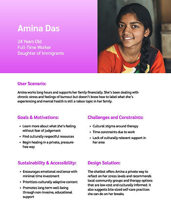
The personas were created to represent the most affected and undeserved mental health users. I developed these personas based on demographic, cultural, and emotional diversity to ensure they reflect different identities, considerations, environments, and support needs. They highlight real-world barriers to mental health access, such as geographic isolation, cultural stigma, gender identity, and language barriers, to guide inclusive and empathetic UX decisions.
Each persona directly supports MindBridge's mission to create culturally inclusive, accessible, and emotionally intuitive mental health support experiences. These user perspectives will guide design choices related to tone, accessibility, content flow, and platform features to ensure that the solution works for those who need it most.


User Scenarios


Information Architecture

User Flow

Jobs To Be Done
Through this exercise, I gained a deeper understanding of the emotional and functional needs that drive my users' interactions with MindBridge. The JTBD framework helped uncover the real-life situations, motivations, and desired outcomes that influence how underserved young adults seek mental health support. This perspective emphasized that users aren’t just completing tasks; they’re trying to make emotional progress, feel validated, or regain control in moments of stress, isolation, or confusion.
By differentiating between functional jobs (e.g., completing a mood check-in, finding a resource) and emotional jobs (e.g., feeling safe, understood, or in control), I was able to identify specific pain points such as fear of judgment, language barriers, and lack of cultural relevance in existing solutions. This is where current tools fall short and where MindBridge can truly make a difference.
The exercise also helped me develop feature improvements directly tied to user needs, like privacy-first design, language support, and emotional tone options. Overall, this process deepened my empathy for users and highlighted the importance of designing not just for efficiency, but for emotional well-being.

Journey Map
Both the Jobs to Be Done and Journey Mapping exercises were useful in clarifying the emotional and functional needs of MindBridge’s target users. This has been crucial to the main goal of MindBridge, which is to provide easily accessible mental health services to underserved youth. JTBD helped me focus on what the users are trying to accomplish and progress in their emotional lives. This highlighted relatable situations where users like Jordan or Luis are vulnerable and what success looks like to them in those moments.
The journey map highlighted how emotionally nuanced each stage of the journey became, even for small design decisions. For example, the calm chatbot tone or a quick mood check-in can make a big impact in sensitive situations. This gave me actionable insights into how to meet the users where they are.
Together, these methods helped me prioritize which features should be the main focus to the MVP, like language toggles, easily accessible mood check-in chatbot, and privacy-first journaling. They’ve made the next steps feel more focused and human-centered, guiding me toward a Minimum Viable Experience that delivers trust and emotional relief.

Design System


Design System Reflection
Sketches


Sketches Overview
Mid-fi Wireframes
The feedback on the sketches led to several revisions in the wireframes. Key changes include condensing the “Account” screen and adding drop-down chevrons for user input, though the design of the drop-down data presentation is still under consideration. The “My Plan” screen has become the favorite design, offering important information and organizing upcoming sessions by frequency. Resources will be categorized by format for better navigation, and the “personalized goals” section has been renamed to “favorite coping skills” to remind users of effective strategies established during sign-up.
I'm still deciding on the drop-down filter menu's appearance, planning further research on effective presentation. While satisfied with the therapist bio cards, there's a desire to enhance their visual appeal. The resources page will have a search bar for user convenience, though its current placement feels awkward. The user plans to limit the number of videos or articles listed to avoid overwhelming first-time users. They are also considering incorporating user stories in the “peer stories” section to create connections among users. Overall, the user is looking forward to further development and feedback.


High-fi Wireframes (Version 1)


Version 1 Evaluation & Changes
Heuristic Evaluation and Accessibility Audit


High-fi Wireframes (Version 2)


Version 2 Evaluation & Changes
User Test Plan


Final Prototype
Changes made:
-
Created filters for the therapists page.
-
Moved the hamburger menu to the top of the screen, instead of under the time to make it look more professional.
-
I realized that there wasn’t a way for users to access saved chats or journals, so I added them into the pull-out menu.
-
Once I made the menu, the plan and resources were lost in navigation, so i added it to the account page.
-
Moved the personal information dropdown to a edit button for easier access and limit the number of items listed in the account menu.
-
Added A mood dashboard for users to track their progress.