Target in Focus: Designing AR Features to Elevate In-Store Shopping
A research-driven AR experience that empowers users to compare products, explore offers, and shop with confidence by blending digital innovation with Target's in-store experience.
Overview
This school project focused on designing an augmented reality (AR) feature for the Target Circle app, aligning with Target’s brand values and goals. The objective was to create an in-app AR experience that enhances in-store shopping by helping users compare products, view prices and ratings, and discover personalized offers.
As the UX designer, I conducted brand and user research, created user personas and user flows, and designed three key AR features. My work included concept sketches, high-fidelity wireframes, and a clickable prototype that reflected research insights and user needs.
Problem
The most significant problem I set out to solve was how to make in-store shopping at Target more efficient and engaging by reducing the time and effort it takes for users to compare products, understand value, and discover relevant deals, without overwhelming them with unnecessary digital noise.
The goal: To design an intuitive, brand-aligned AR experience within the Target Circle app that empowers users to quickly access product details, compare options, and find personalized offers, enhancing their confidence and decision-making while shopping in-store.
Solution
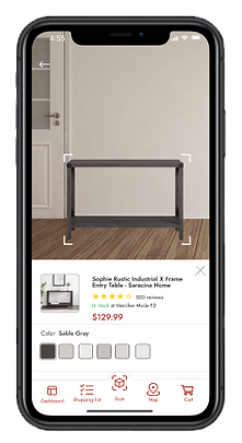
To address the challenges of in-store decision fatigue and limited product visibility, I designed three augmented reality (AR) features within the Target Circle app that simplify comparison shopping and enhance product discovery.
Key solutions included:
-
AR Product Comparison: Allowed users to scan shelves and instantly view side-by-side product details like price, size, and value.
-
Ratings & Reviews Overlay: Made it easy to see real-time feedback directly on product packaging, reducing uncertainty.
-
Personalized Deal Finder: Highlighted user-specific offers in-store through AR, driving engagement and loyalty.
> These features directly supported Target’s goals of increasing customer confidence, improving in-store navigation, and creating a more dynamic, personalized shopping experience.
Project goals
The project aimed to achieve several key goals that addressed both user needs and Target’s business objectives. After developing an initial action plan and aligning with stakeholders, I moved forward with the design process guided by the following goals:
-
Enhance the in-store shopping experience by making product comparison, reviews, and deals more accessible through AR.
-
Increase customer confidence and reduce decision fatigue by providing clear, real-time information directly in the physical retail environment.
-
Encourage app engagement and repeat usage by integrating personalized, value-driven features within the Target Circle app.
-
Align the AR experience with Target’s brand to ensure consistency, trust, and intuitive usability across digital and physical touchpoints.
> These goals informed every stage of the project—from user research to wireframing to the final prototype.
Role
Lead UX Designer/Researcher
Tools
Figma
Team
Solo project | Sought feedback from instructors & peers
Timeline
Nov 2024 - Dec 2024 (4 weeks)
Target Brand Research & User Analysis
To ensure the AR feature aligned with Target’s identity and customer expectations, I conducted thorough research on Target’s brand values, retail environment, and existing digital experiences. I also analyzed user behaviors and pain points through surveys and market research to understand shoppers’ challenges with product comparison and deal discovery in-store. This foundational research informed clear project goals focused on enhancing user engagement, simplifying decision-making, and maintaining brand consistency throughout the AR experience.

Research Conducted
-
Brand Analysis: Reviewed Target’s mission, values, and existing digital platforms (Circle app, website) to ensure design consistency and brand alignment.
-
Competitive Benchmarking: Analyzed AR features and shopping tools used by other retailers to identify best practices and innovation opportunities.
-
User Surveys & Interviews: Gathered insights from potential Target shoppers about their in-store behaviors, pain points, and attitudes toward AR technology.
-
Persona Development: Synthesized research findings into detailed user personas representing key customer segments and their needs.
-
User Journey Mapping: Mapped typical shopping experiences to uncover moments where AR could reduce friction and improve decision-making.
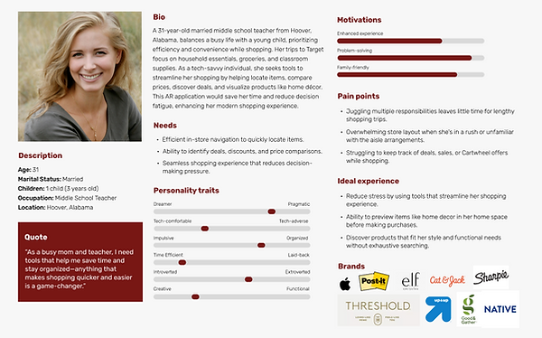
Persona
I created user personas to ensure the design decisions were grounded in a clear understanding of Target shoppers’ diverse needs and behaviors. Personas helped bring abstract user data to life, making it easier to empathize with real users throughout the process.
To build the personas, I drew from multiple data sources, including user surveys, interviews, market research, and insights from Target’s existing customer base. This data allowed me to capture a range of shopping habits, tech comfort levels, and pain points.
Each persona included demographic details, shopping goals, technology usage, frustrations, and motivations related to in-store shopping and mobile app use. This information helped me prioritize features and design interactions that would resonate with different user types.
The personas were referenced throughout the design process—particularly during ideation, user flow creation, and usability testing—to keep the user perspective front and center. Reflecting on the personas ensured the AR features addressed actual user challenges, improving both usability and relevance.
User Flow
I created a user flow to visualize the step-by-step journey shoppers take when using the AR features within the Target Circle app. This flow mapped key touchpoints—from launching the AR scanner, comparing products, viewing ratings, to discovering personalized offers—ensuring a smooth and intuitive experience. The user flow helped identify potential friction points and guided the layout of screens and interactions for optimal usability.
.jpg)
Sketches
The main purpose of my sketches was to brainstorm and quickly visualize different ideas for the AR features, allowing me to explore various layouts and interactions before moving into digital design. I based my sketches on insights from user research, personas, and user flows to ensure they addressed real user needs and pain points.
I created multiple versions that varied in how AR information—such as product comparisons, ratings, and personalized offers—was displayed on screen, testing different placements and levels of detail. I chose the version that balanced clarity with ease of use, positioning key elements like the product info and deal highlights within easy reach of users’ thumbs.
The sketches helped me clarify the structure and hierarchy of the interface, providing a solid foundation to create wireframes and prototypes. They made it easier to communicate ideas and iterate quickly based on feedback.


Wireframes
I created mid- and high-fidelity wireframes to visualize the structure and layout of the AR features within the Target Circle app. These wireframes translated my sketches into more refined designs, focusing on usability, information hierarchy, and screen-to-screen flow. Each screen included core features like product overlays, comparison details, and personalized offers, designed to be intuitive and aligned with Target’s brand. The wireframes served as a blueprint for my prototype and allowed for early feedback before moving into full interactivity.


Progress Update
I wanted to share an update on my progress with Mr. Bloom's feedback regarding my mockups. As always, I get a bit nervous before receiving feedback, but this month has been surprisingly manageable.
I’m still facing a few alignment issues. I hoped that manually adjusting components along the same X and Y axis would resolve these, but it hasn’t worked in all cases. Additionally, I’m having some trouble with the user flow. I’m uncertain about the best placement for the navigation button for the AR feature. I need to experiment more to find an optimal location that maintains the flow and effectively integrates the "view in space" feature.
Thanks to the changes based on the accessibility audit, my mockups have become more functional and have an improved layout. I’m beginning to appreciate the value of darker color tones, especially for individuals with disabilities and older adults who may struggle with reading, particularly when it comes to thin or small text.
I plan to finalize my prototype by tomorrow evening after refining the user flow. Following that, I’ll work on polishing my case study to ensure it looks professional and aligns with the brand.
Prototype
Postmortem
I really enjoyed this class, as I always do, because it provides great insight into what my career will look like as a UX designer. I felt more confident making design decisions and creating all the components and style guides than before.
During the break, I want to explore more shortcuts in Figma to optimize my workflow. I'm still having trouble with responsive design. Additionally, I am looking into starting some IDF certifications and studying more UX terminology so I can be more articulate when discussing my design decisions. While I can understand the tasks and complete them, discussing them is a whole other challenge.
This month, I struggled with time management, which can be attributed to my procrastination, task paralysis, life changes, and various challenges. However, I finished this class strong, and I am happy with how everything turned out.
For incoming students, start as soon as Monday to organize tasks and prioritize your time. It's also beneficial to do additional research. While creating my case study, I went back and changed a few things from my research proposal, and some of the images I found for AR navigation, product exploration, and plane detection looked much better than I could have imagined. I wish I had taken more time to explore different examples instead of just settling for the first two I found.